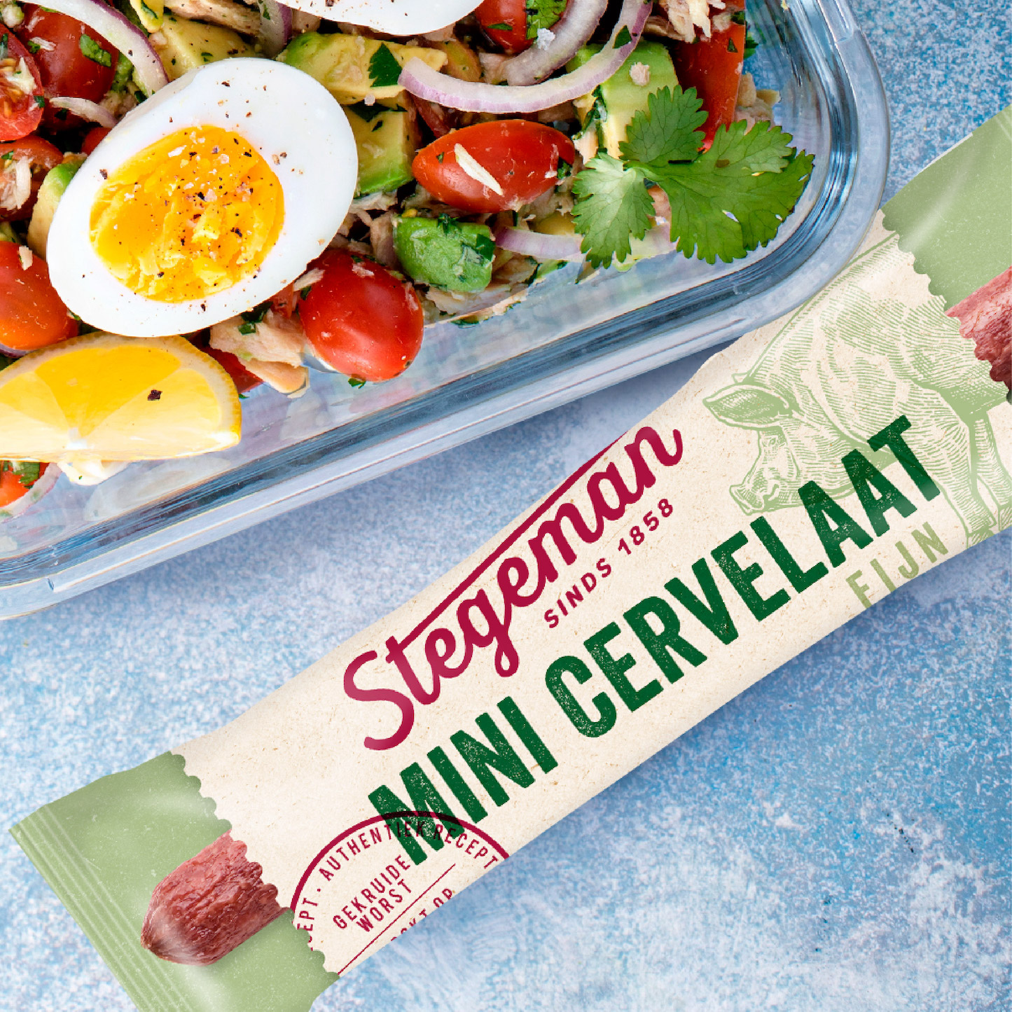
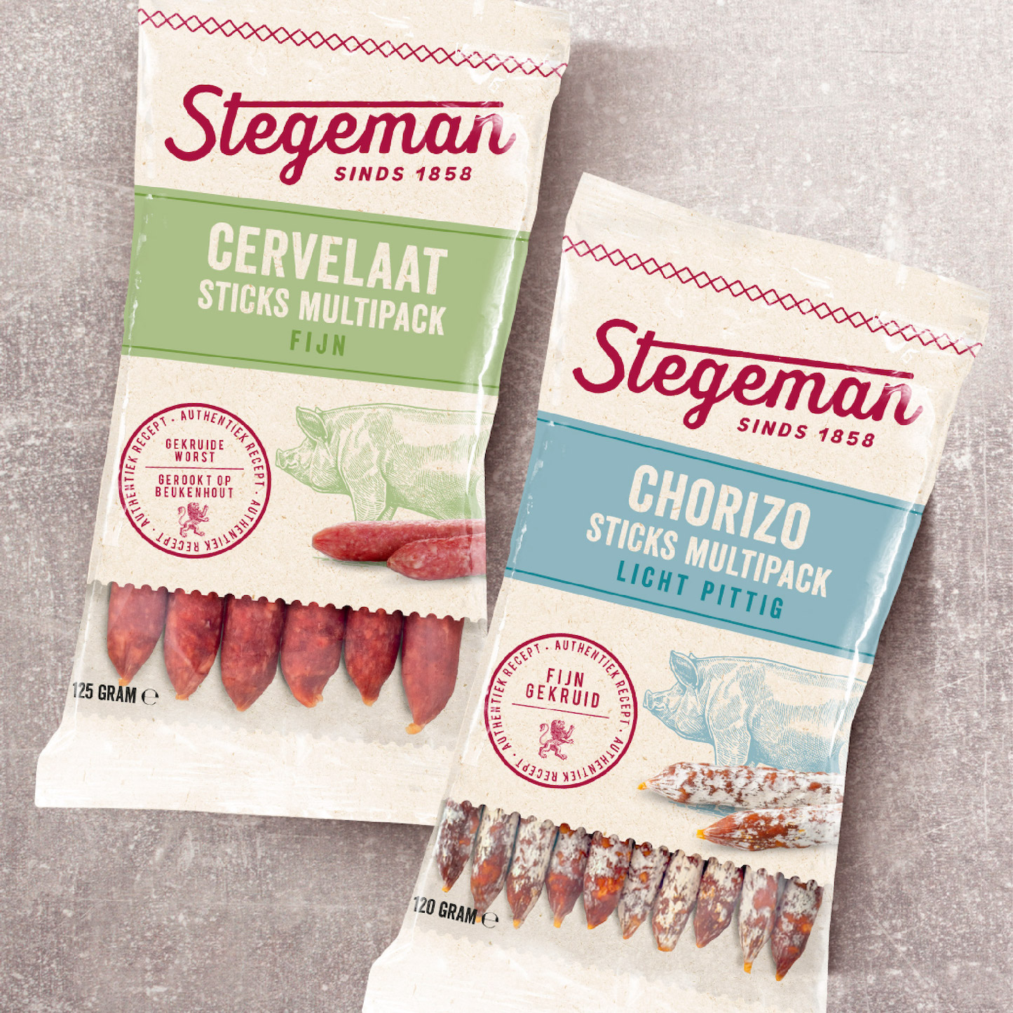
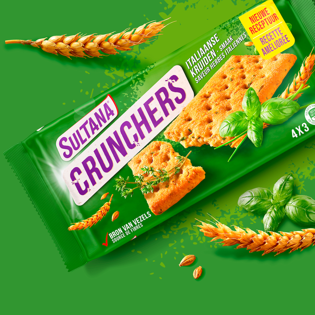
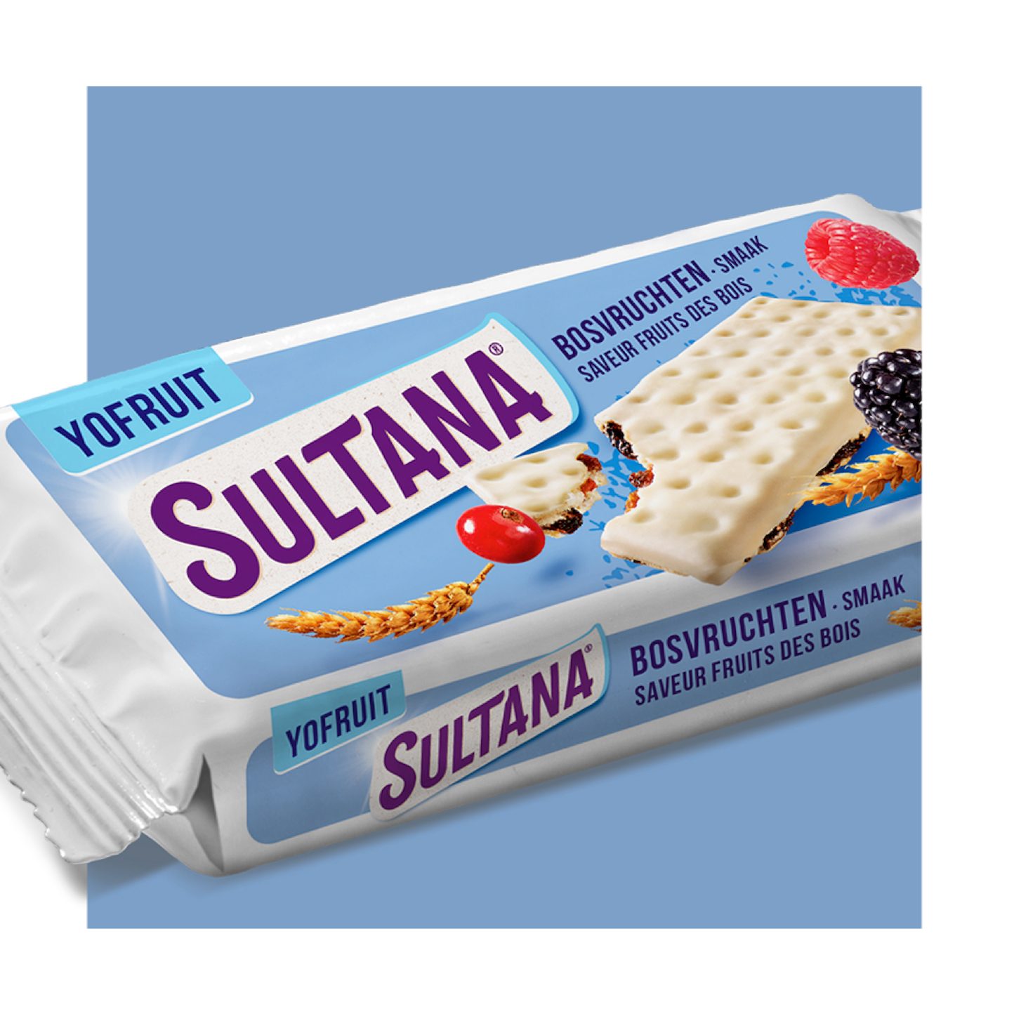
Client / No Fairytales
Project / Portfolio
Category / Brand & Packaging Design
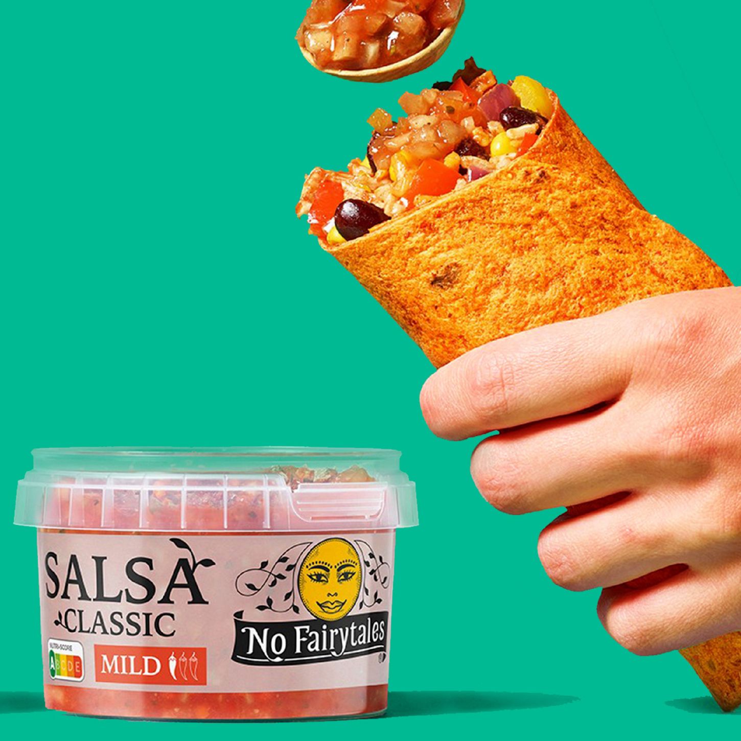
Real food. Real story. No Fairytales. If you make your everyday food a little better, you will eat a little better every day. As a food improver, No Fairytales makes products that contain more vegetables, more fibre and fewer unnecessary calories. Having started at the kitchen table with colourful vegetable tortillas, No Fairytales is now a leader in the supermarket, and we work hard every day to improve even more food. Now also with burritos and muesli bars, for example.
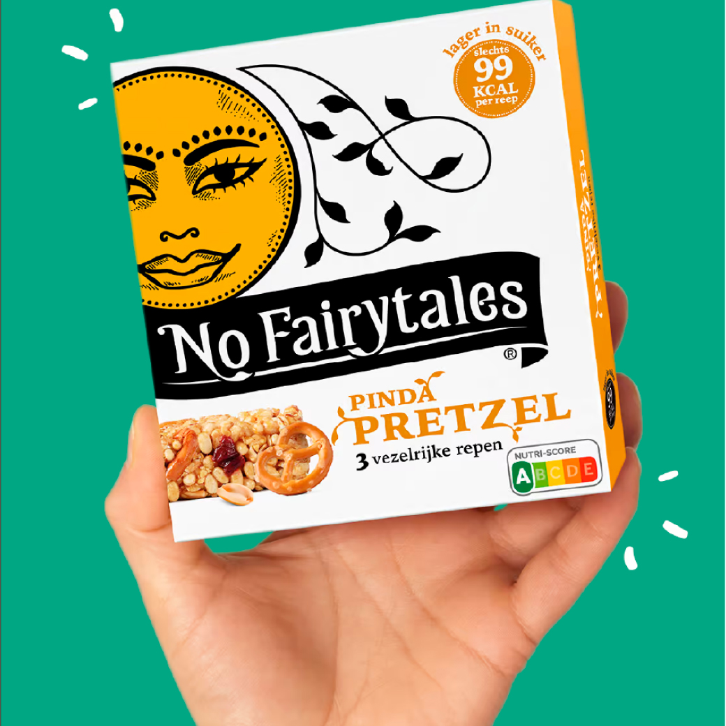
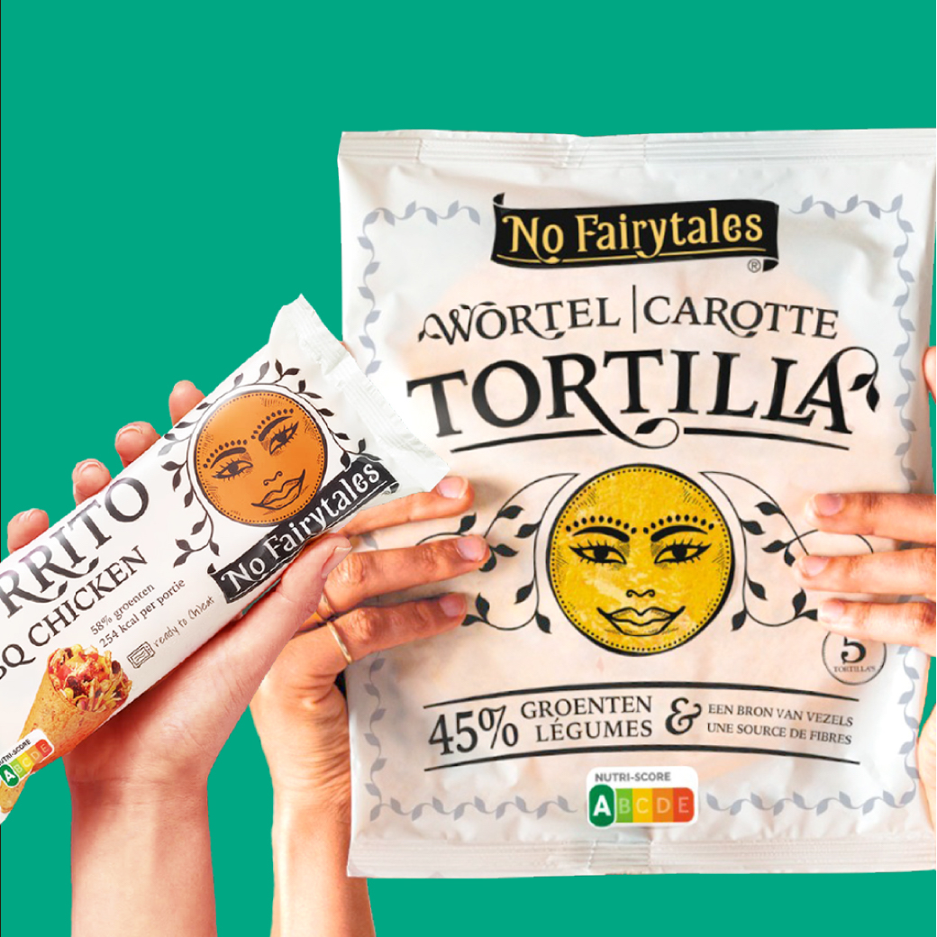
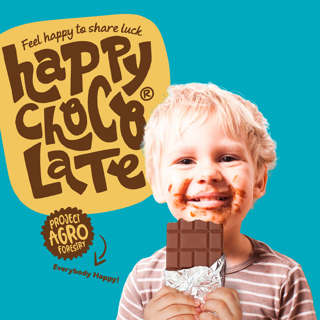
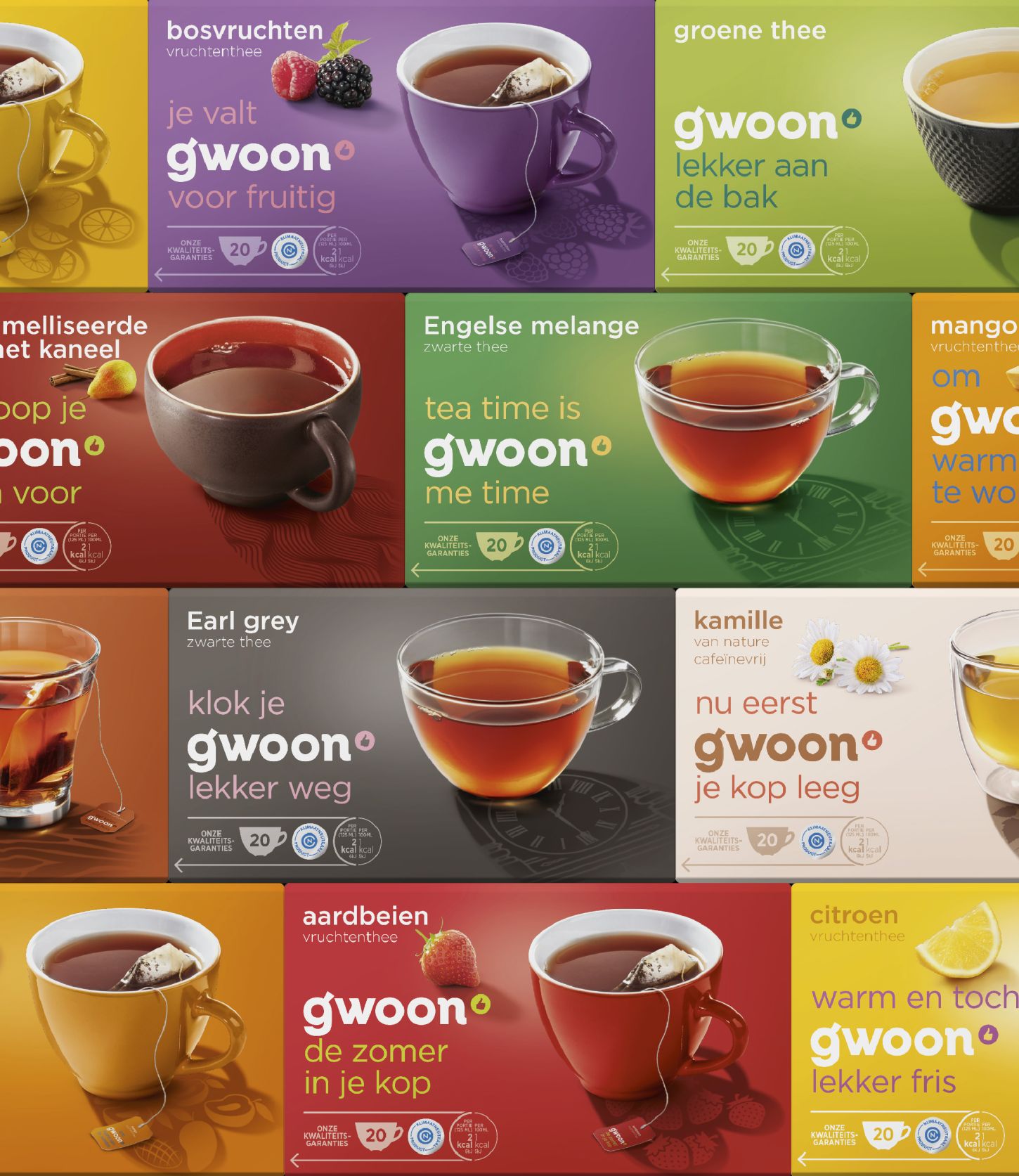
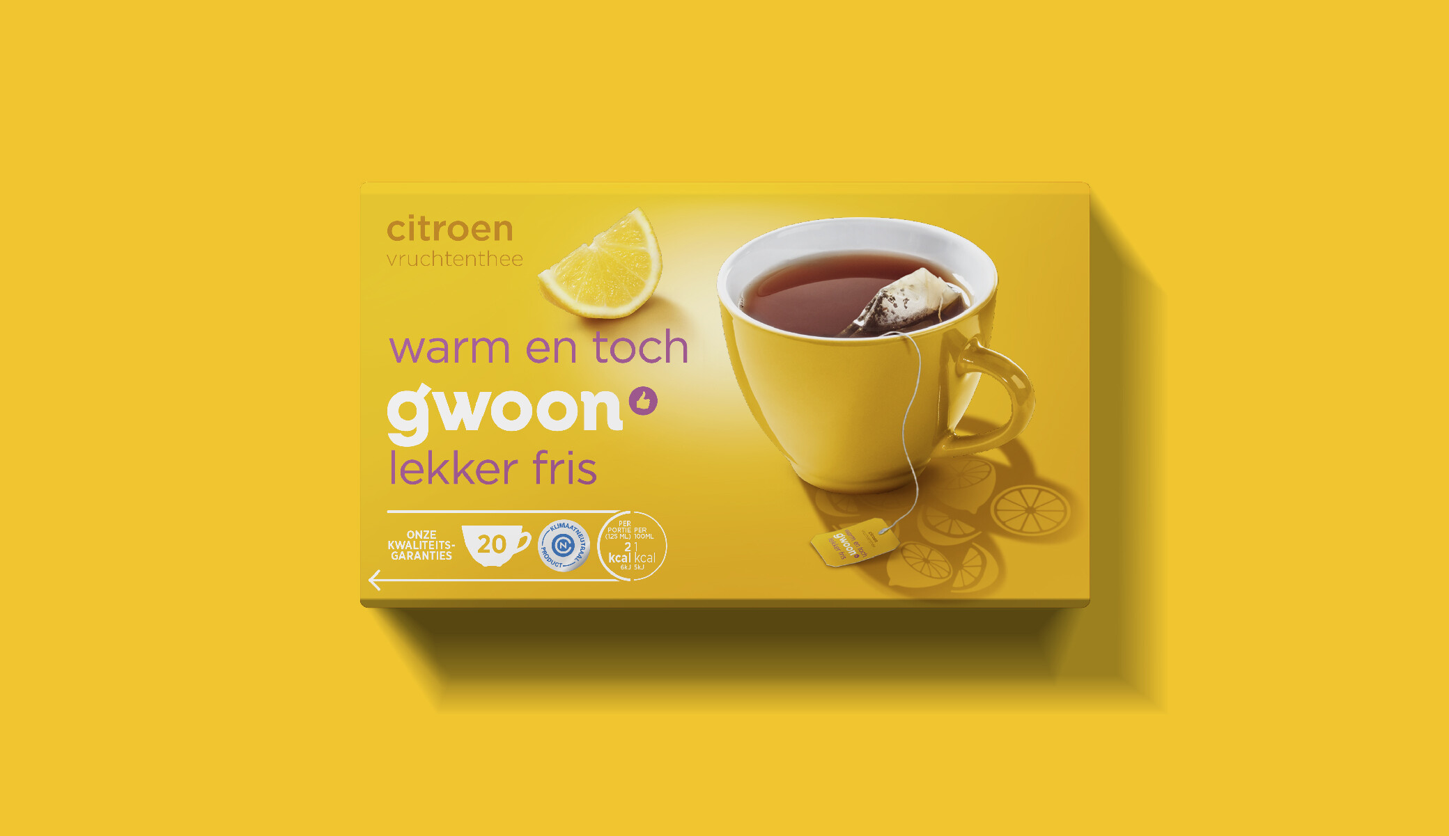
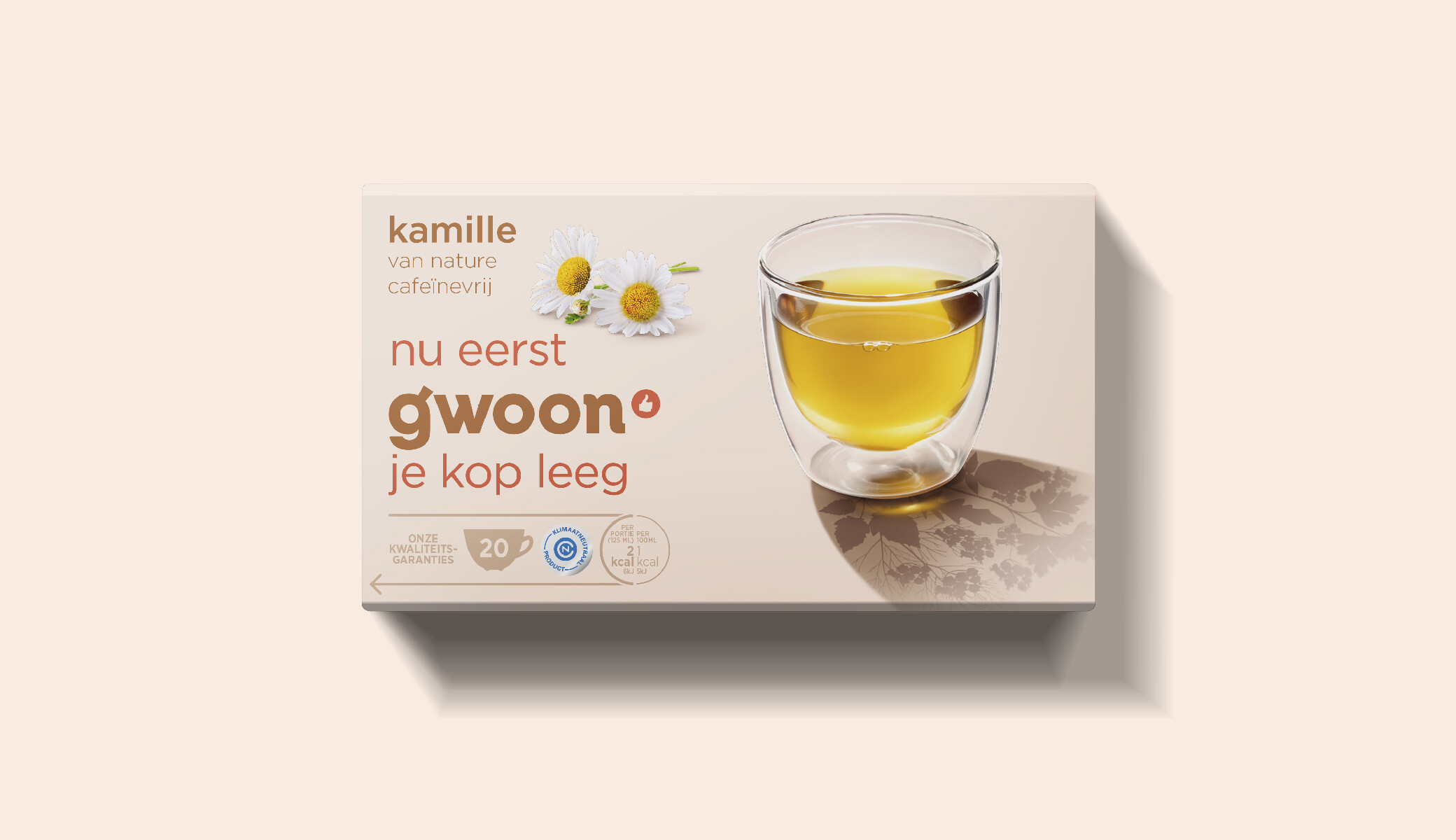
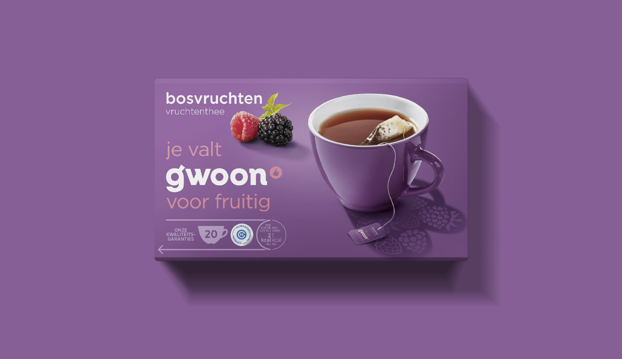
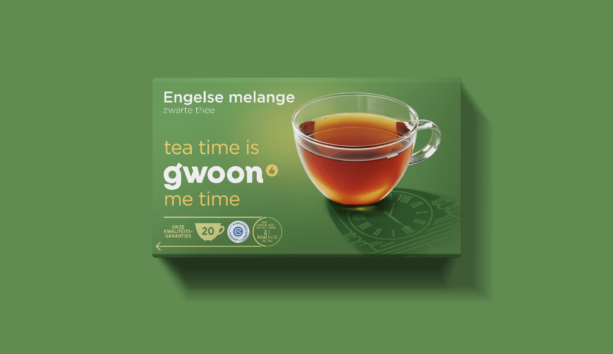
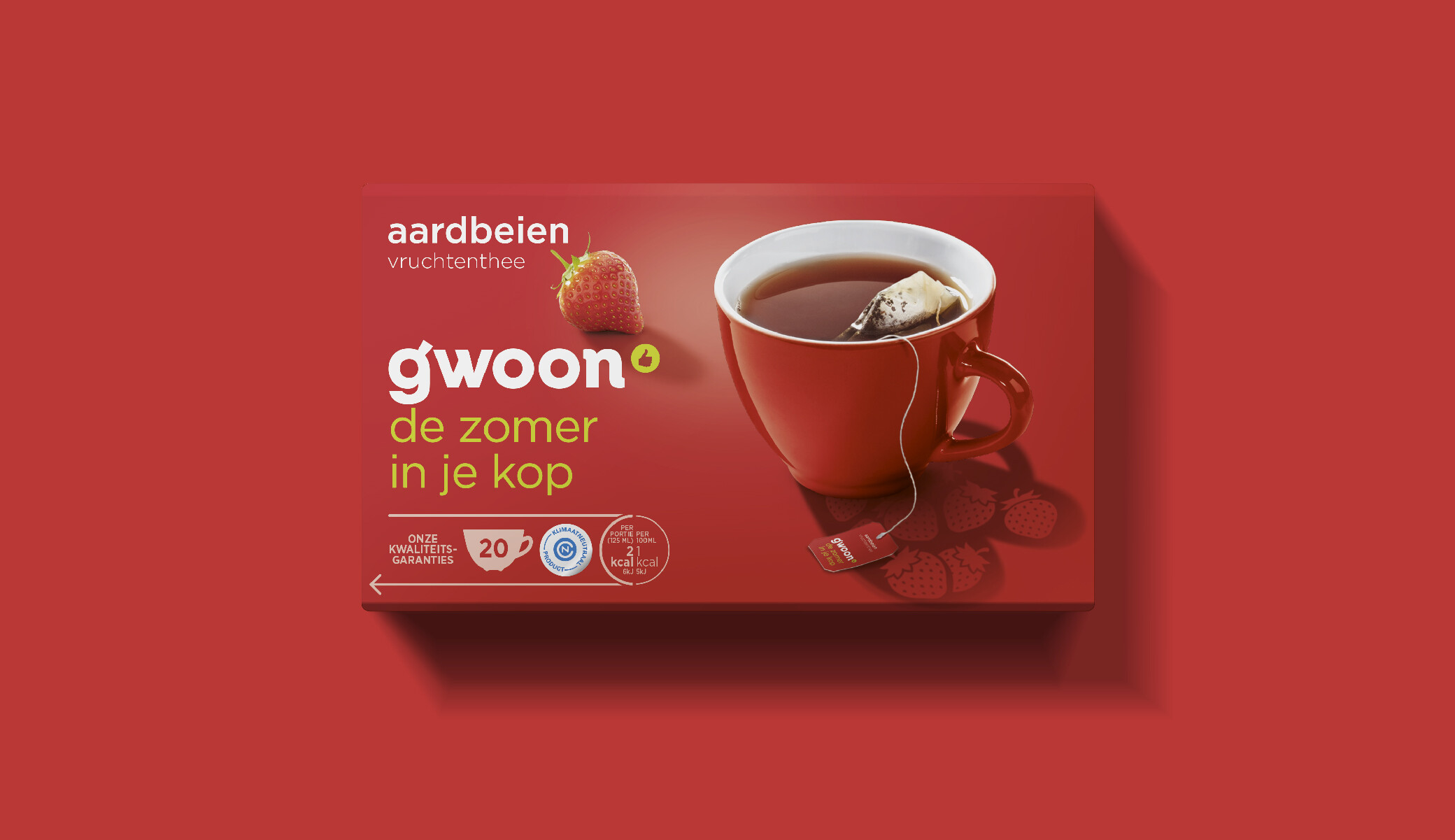
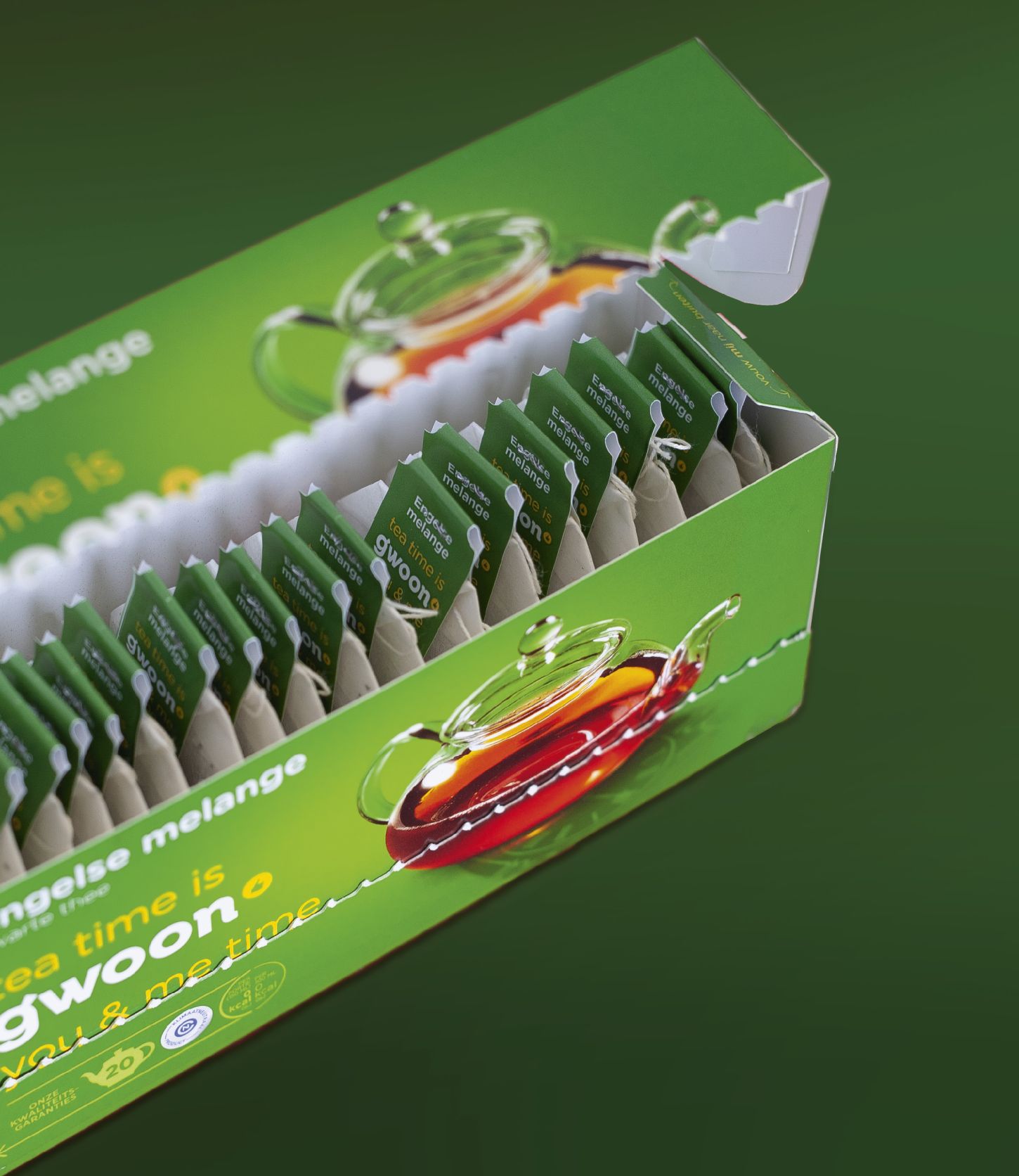
No Fairytales has the smiling sun as its logo. And that turned out to be an important brand and design attribute. Besides the general recognition of the brand, it also represents the positive vibe of No Fairytales. We mainly used the logo with its very own typography in the new generation of the design.