Headings_BIO_plus-15.svg

Client / Superunie
Project / Bio +
Category / Packaging design & visual identity

BIO+ is one of the largest food-brands in the Netherlands. What's unique about this brand is that it consists of a unique collaboration between farmers, food manufacturers and supermarkets. This collaboration allows the brand to offer an extensive choice of organic products in the supermarket. Available to anyone for a good price! 

BIO+ is owned by retail organization Superunie and can be found in all of their supermarkets like Coop, Spar, Hoogvliet and Plus.

Cases_BIO+_en_Ice_Cream_Factory-08.jpg
Cases_BIO+_en_Ice_Cream_Factory-09.jpg

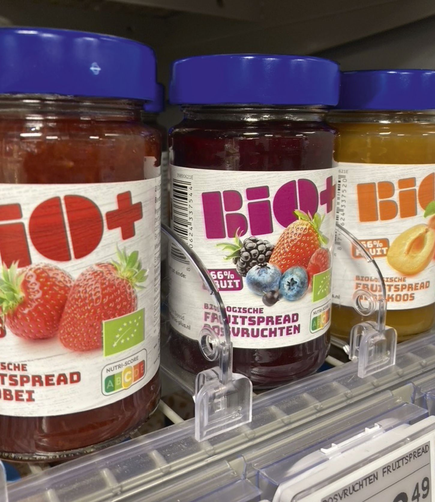
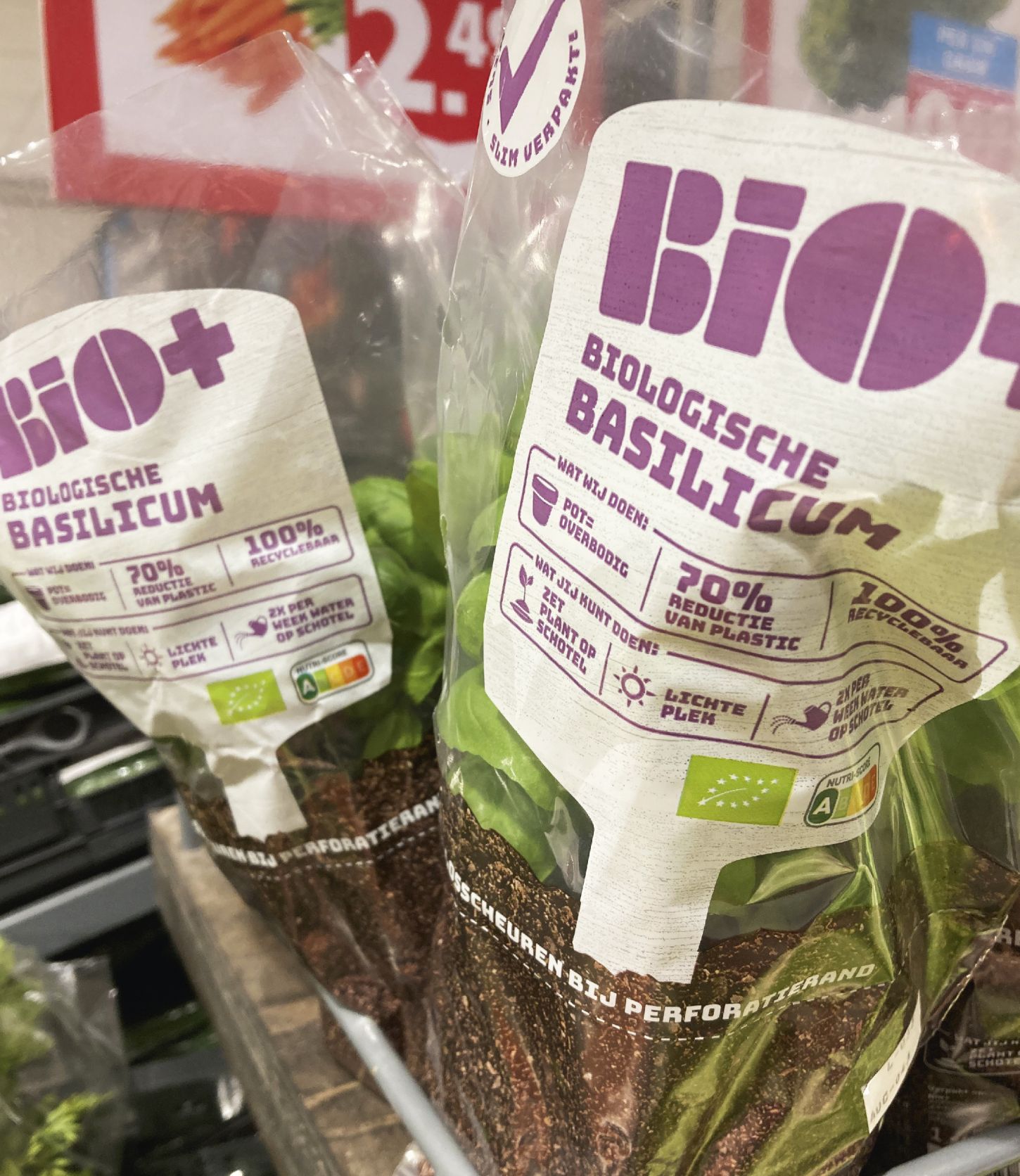
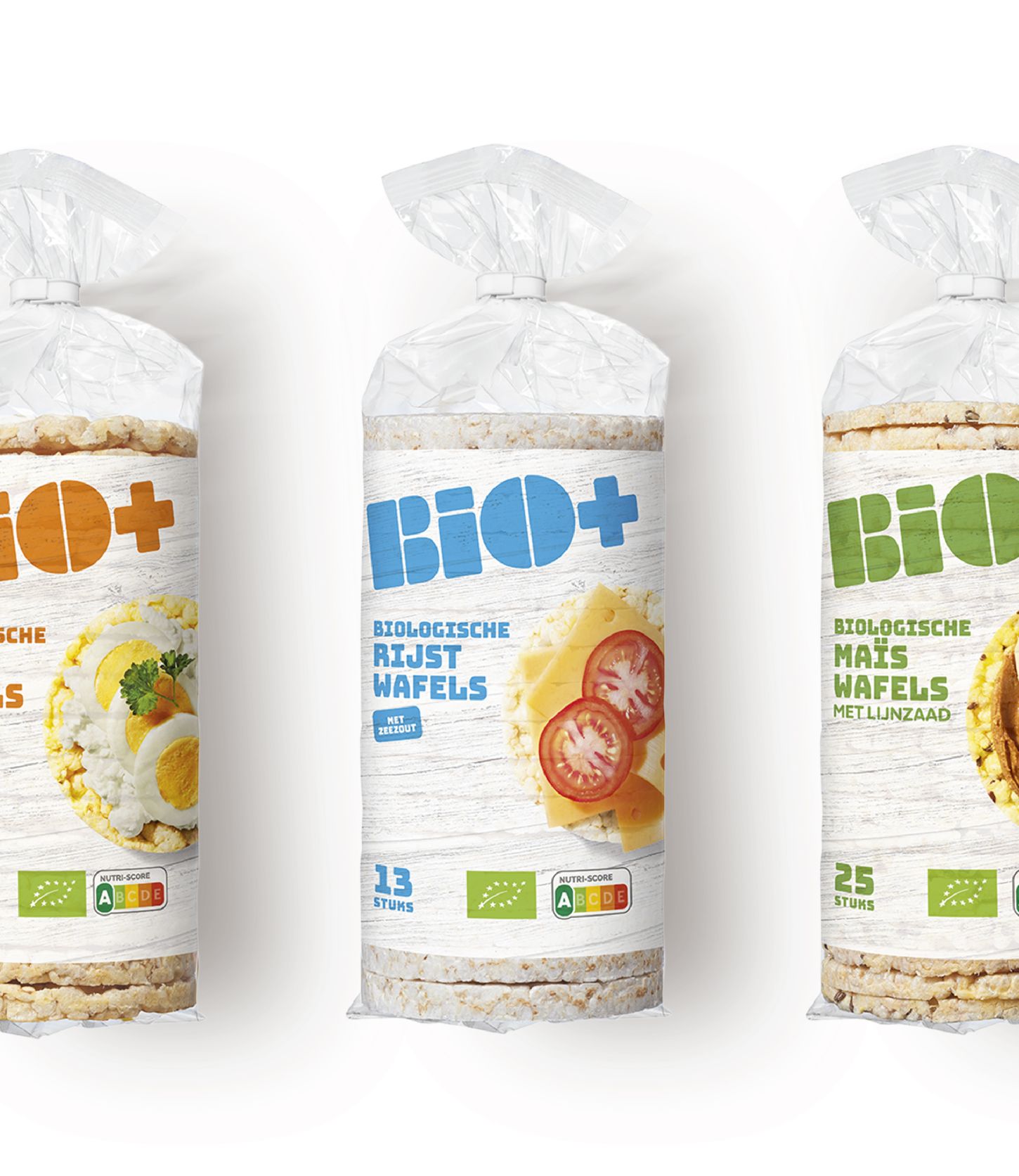
Let us tell you something about the design; We were called in when the BIO+ brand had just completed a restyle. Mountain created a fully-fledged and workable packaging design with unique elements. By applying these elements in a powerful way, it was possible to roll out the entire style consistently yet dynamically across the entire range. 

The look and feel of the packaging is no nonsense with a slanted logo in different colors on a white canvas, combined with the beautiful photography. It gives the products a modern look and feel. Honest products for an honest price. That is the + of BIO+.

Cases_BIO+_en_Ice_Cream_Factory-10.jpg