


Client / Dunea
Project / restyle identity
Category / corporate design & visual identity
Dunea stands for passion for dunes and water. A Dutch water company that uses the dunes in the coastal region to extract drinking water. For more than 140 years, Dunea has focused on providing clean drinking water for the Randstad. A very big responsibility. Of course this all ecologically balanced.
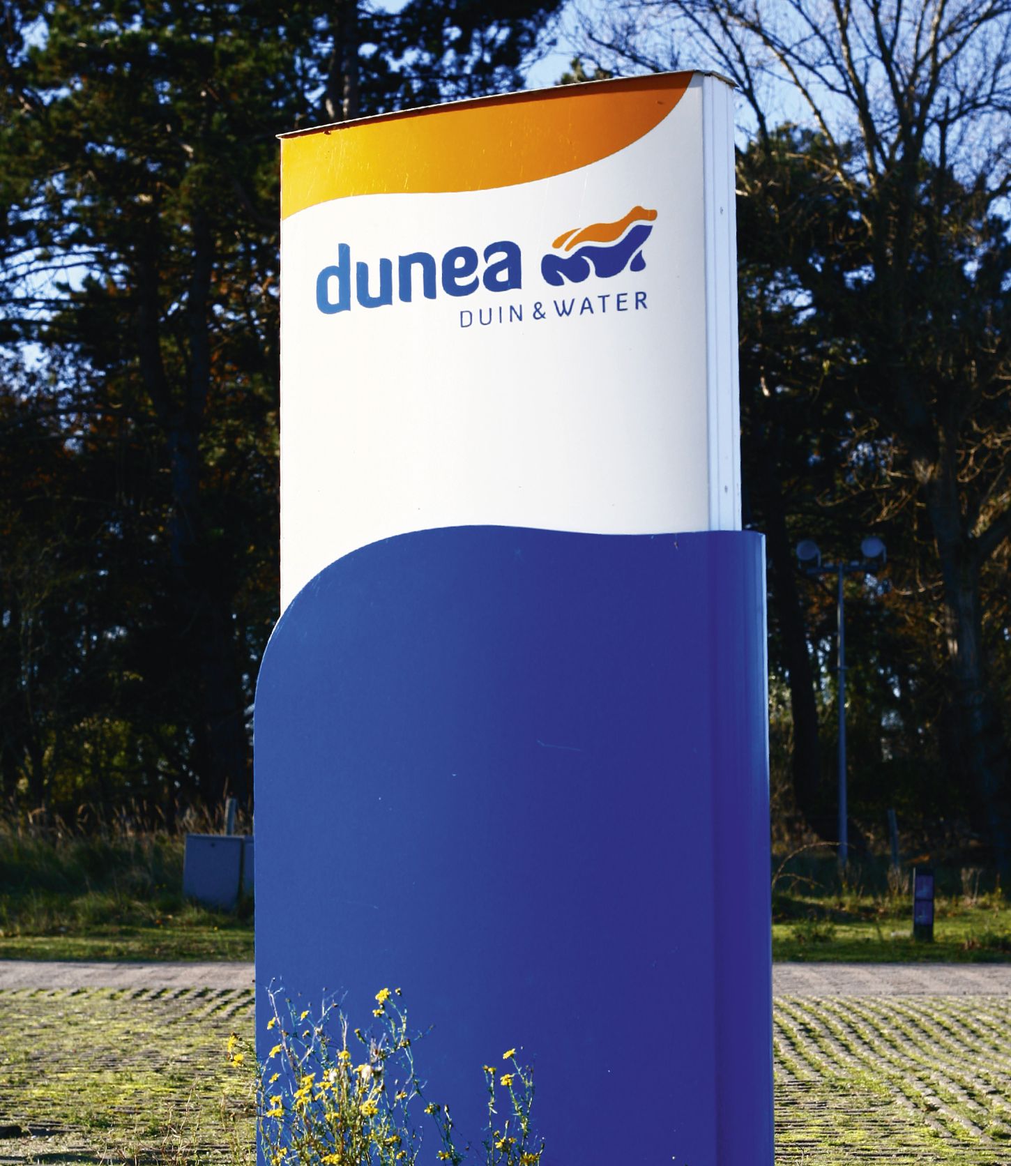
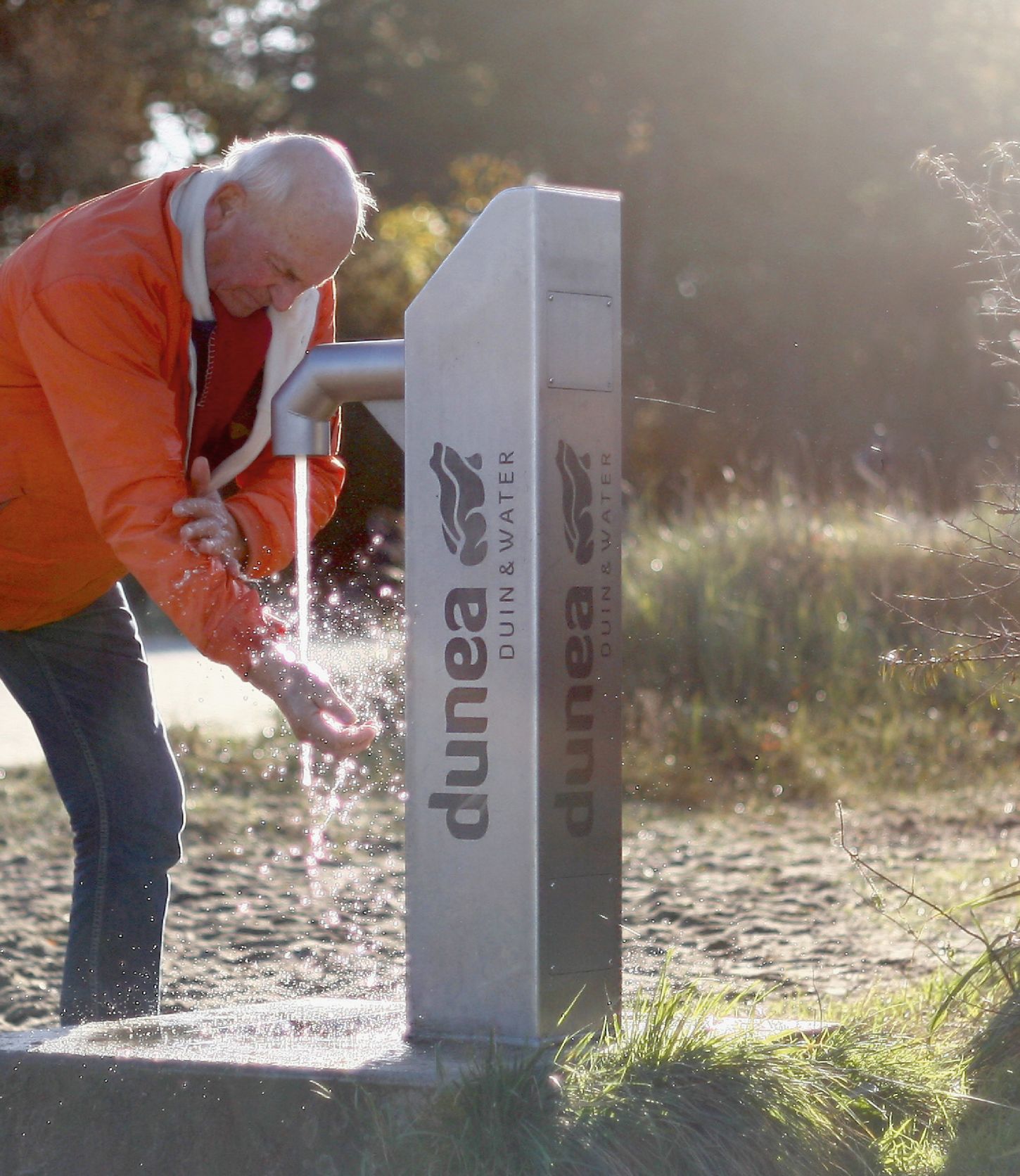
Frogs live in places where the water is clean. This is exactly what reflects Dunea's ambition. Clean drinking water from a healthy environment. A nice detail is that the frog has two clean lines on its back. These symbolize the sand and the water. Dunea is a dynamic organization and covers a large area. Therefore the new identity is visible everywhere, and to be honest, we are really proud of that.
