


Client / Superunie
Project / G'woon thee
Category / Packaging design
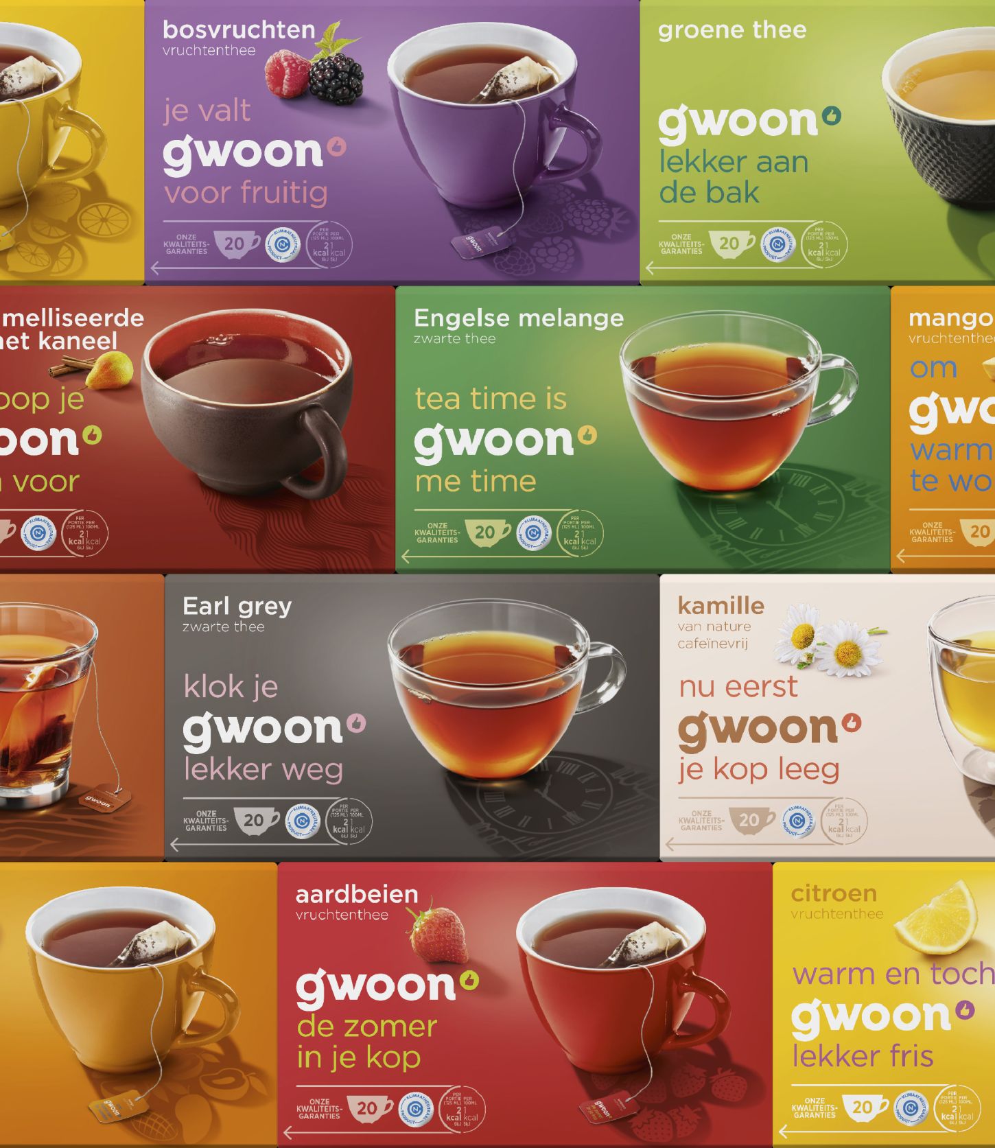
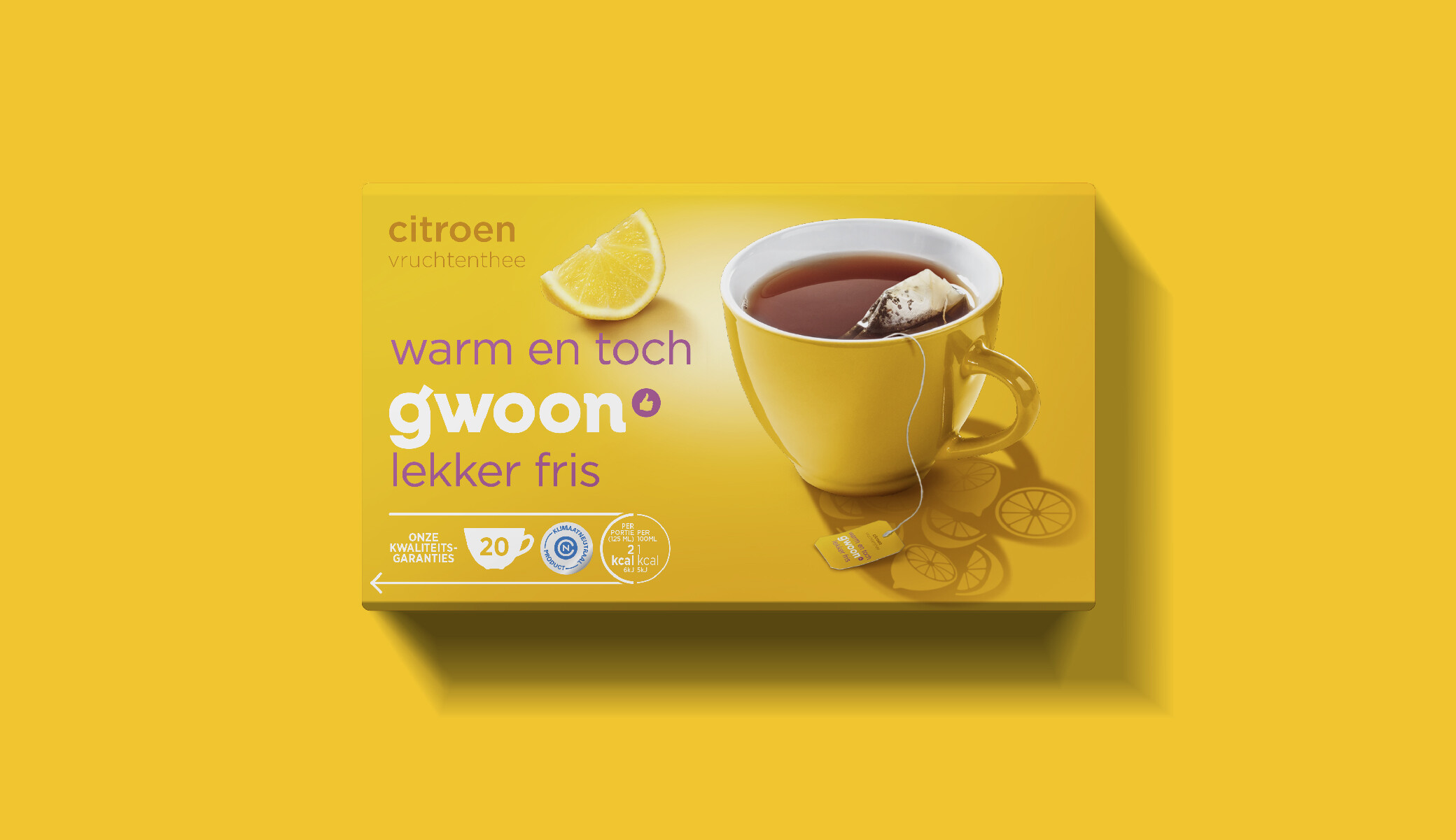
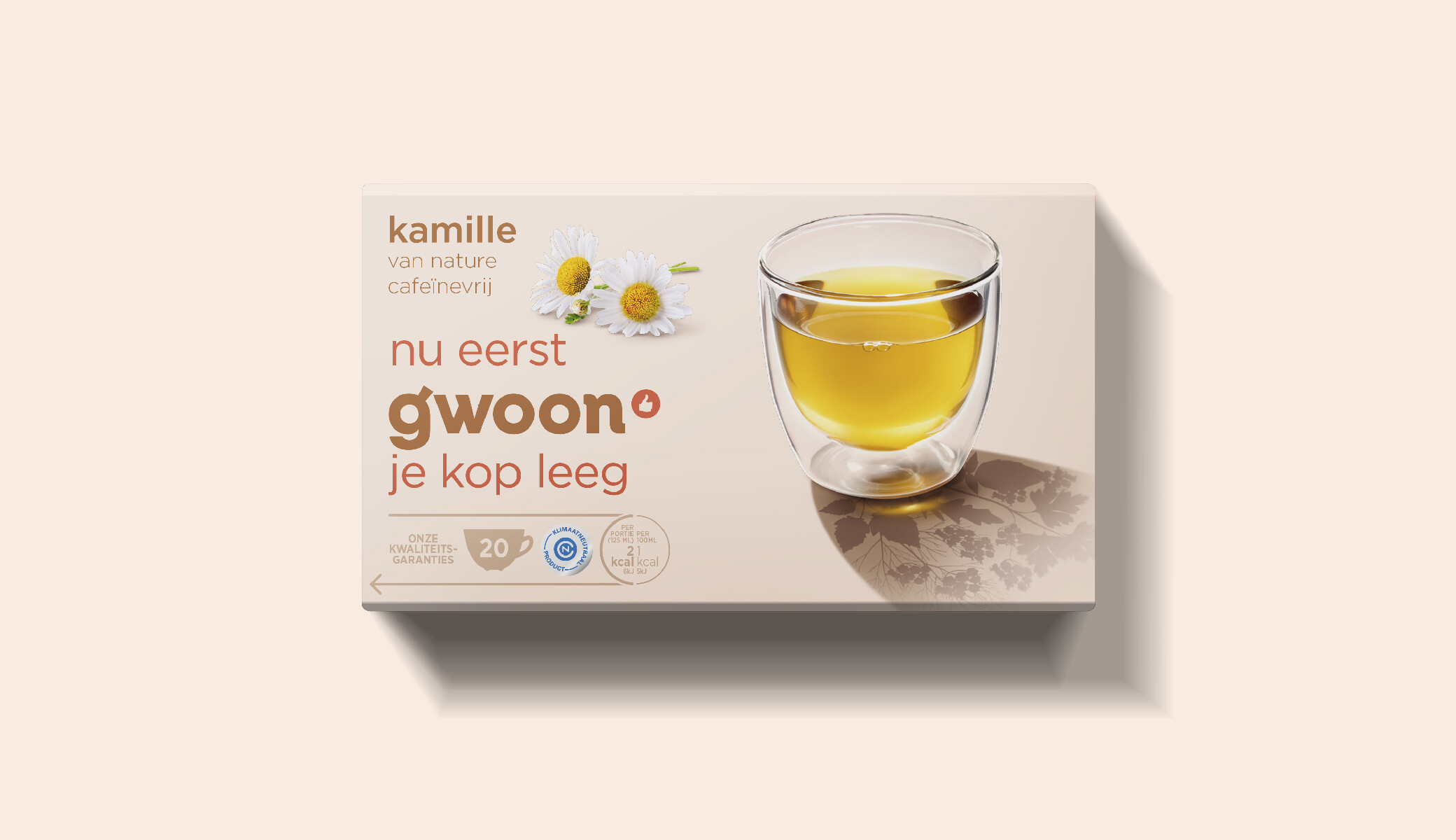
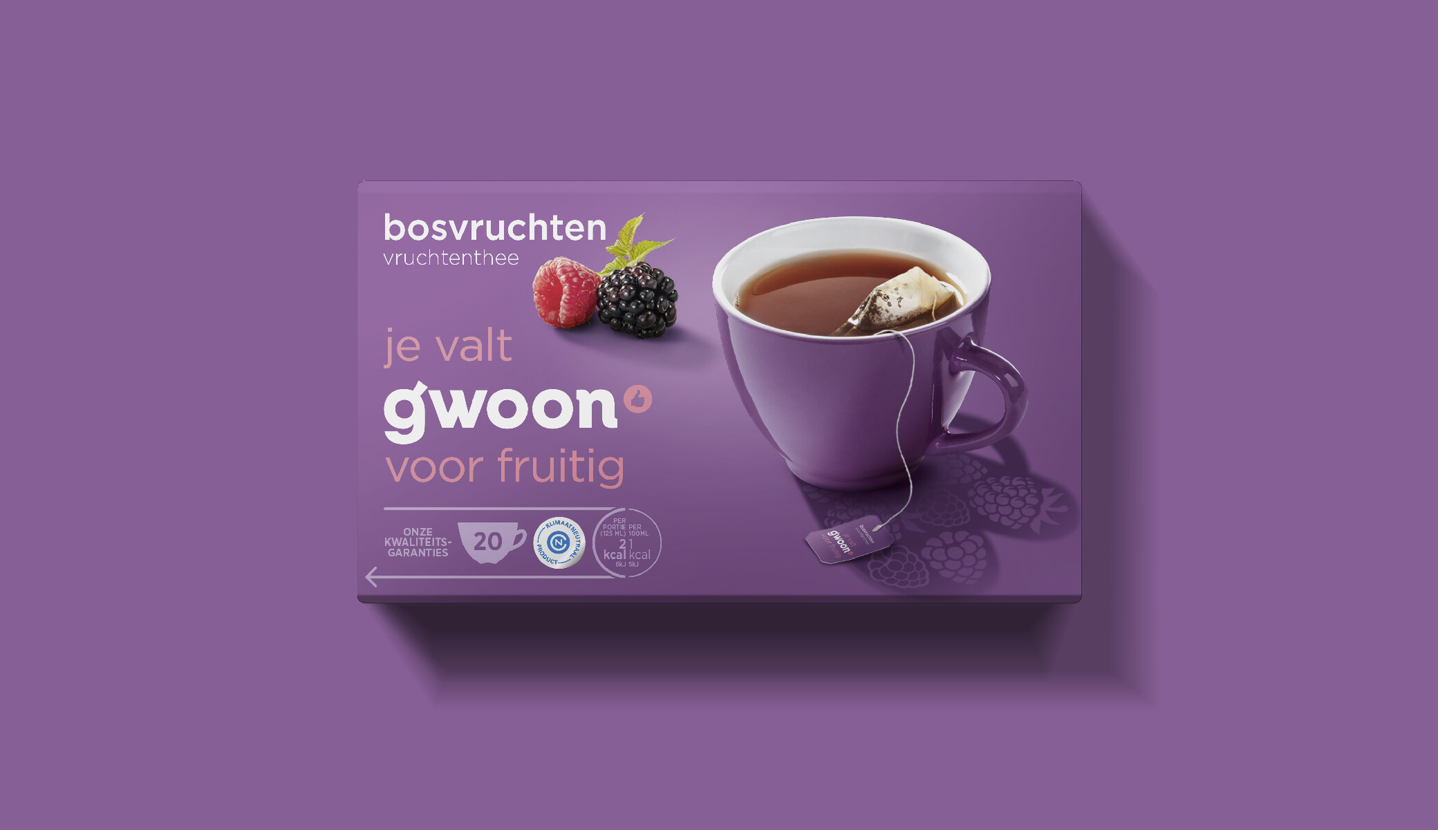
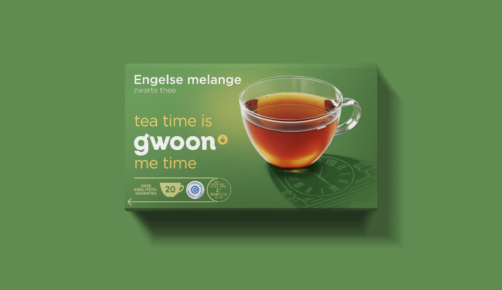
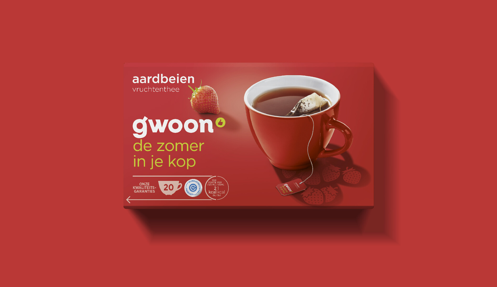
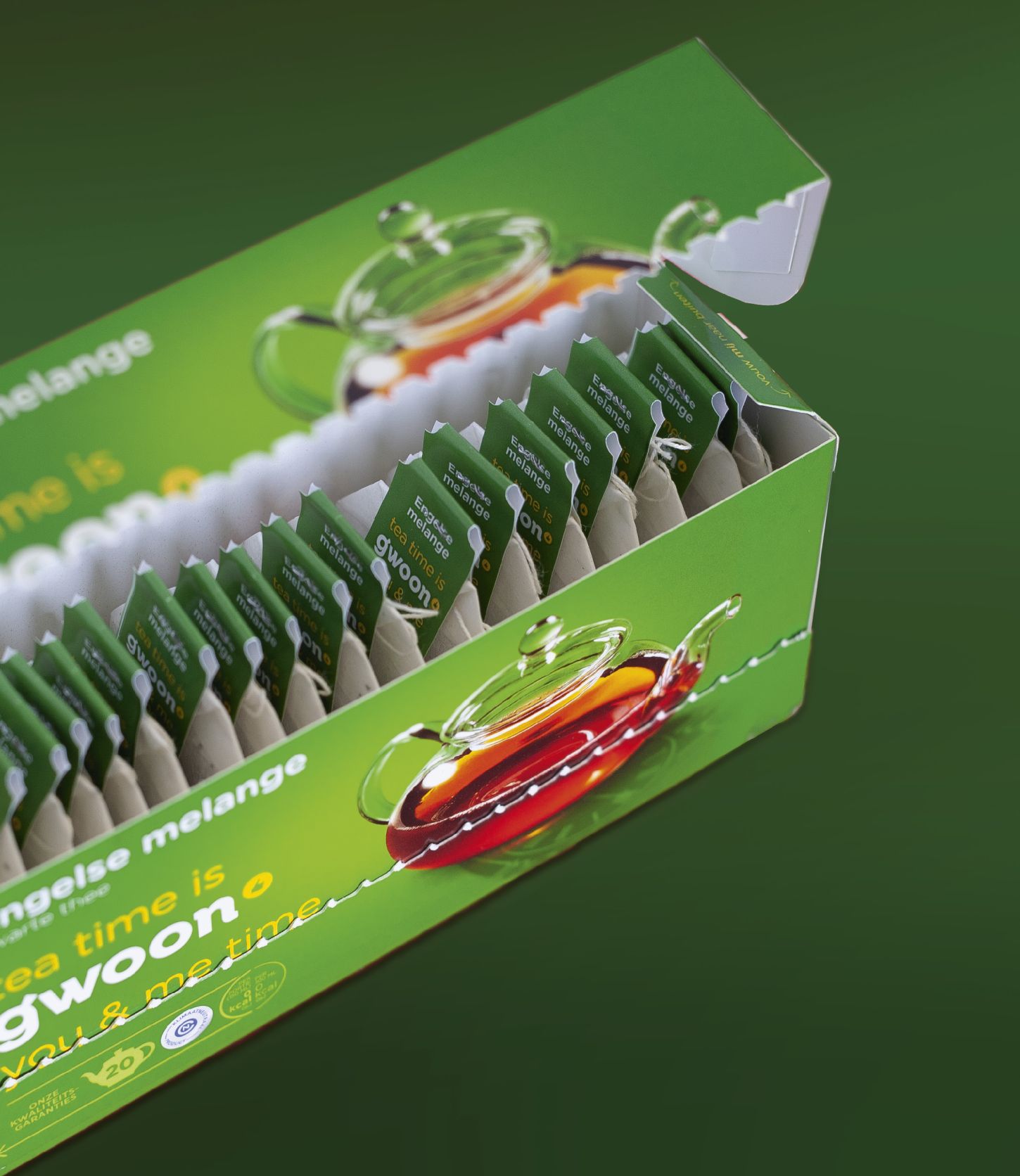
g'woon is a private brand of the organization Superunie that can be found in several supermarket chains. It consists of a rich and versatile range of daily products affordable for anyone. The g’woon products reflect the day to day moments in life that we all know and recognize. Always able to give you a smile. The brand has been around for a while, therefore there was already a base to build upon. It was well put together, but also needed an upgrade. A challenge that gave good insight into our expertise and experience.
call or send an email
Scheveningseweg 42
2517 KV Den Haag
+031 (0)70 302 20 80
info@mountain.nl
OUR PRIVACY STATEMENT
our social plan
Find us on Maps


